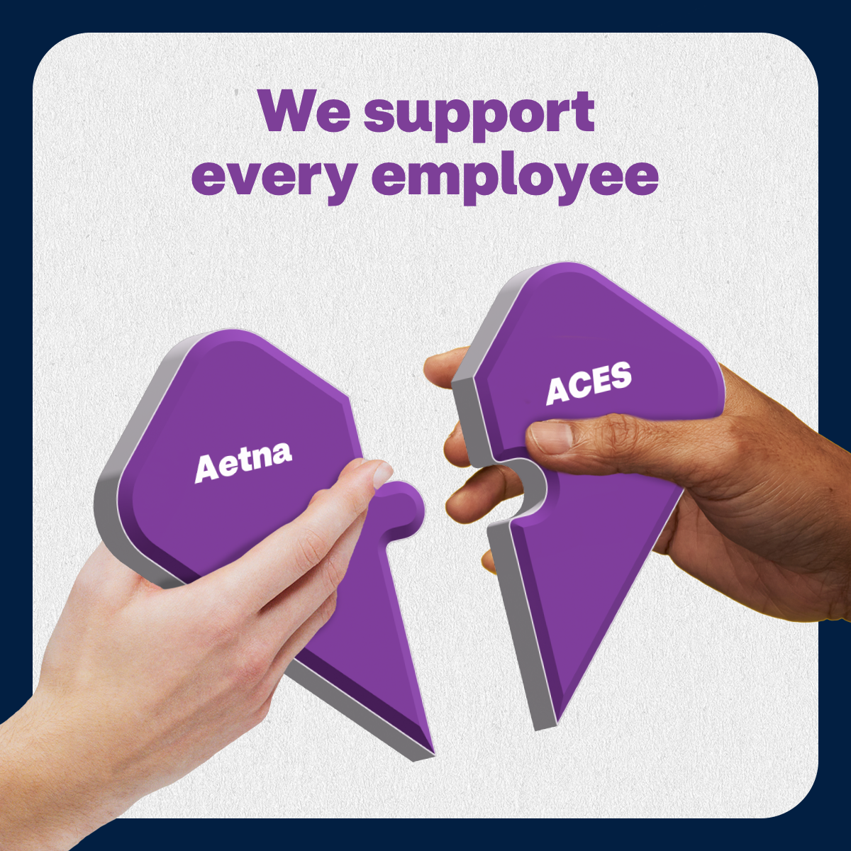
Repositioning a regional healthcare provider as a modern, human-first brand.

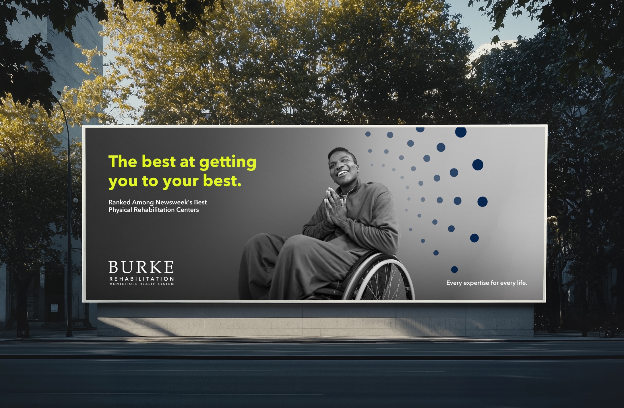
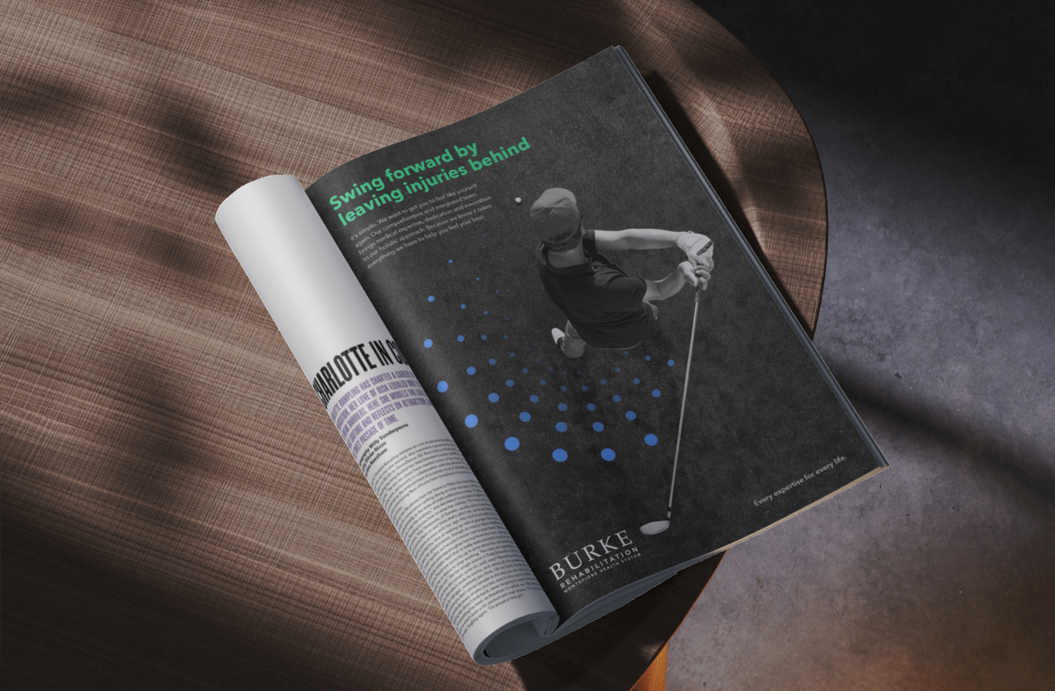
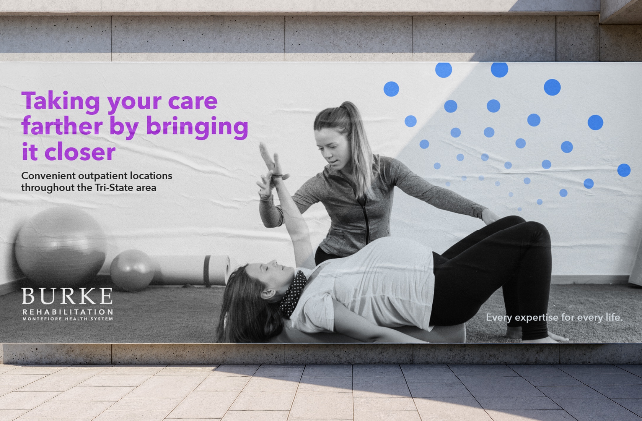
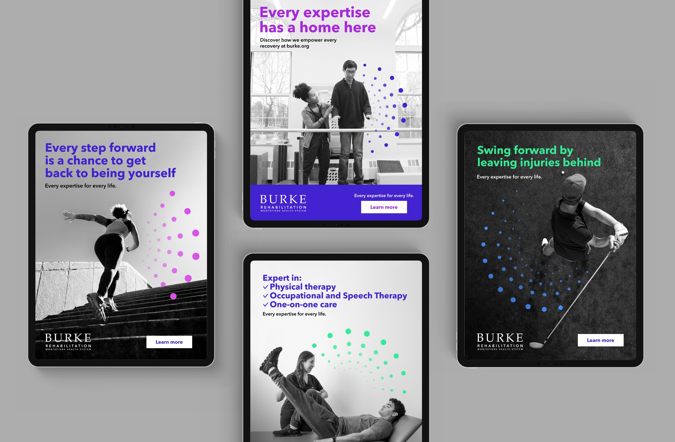
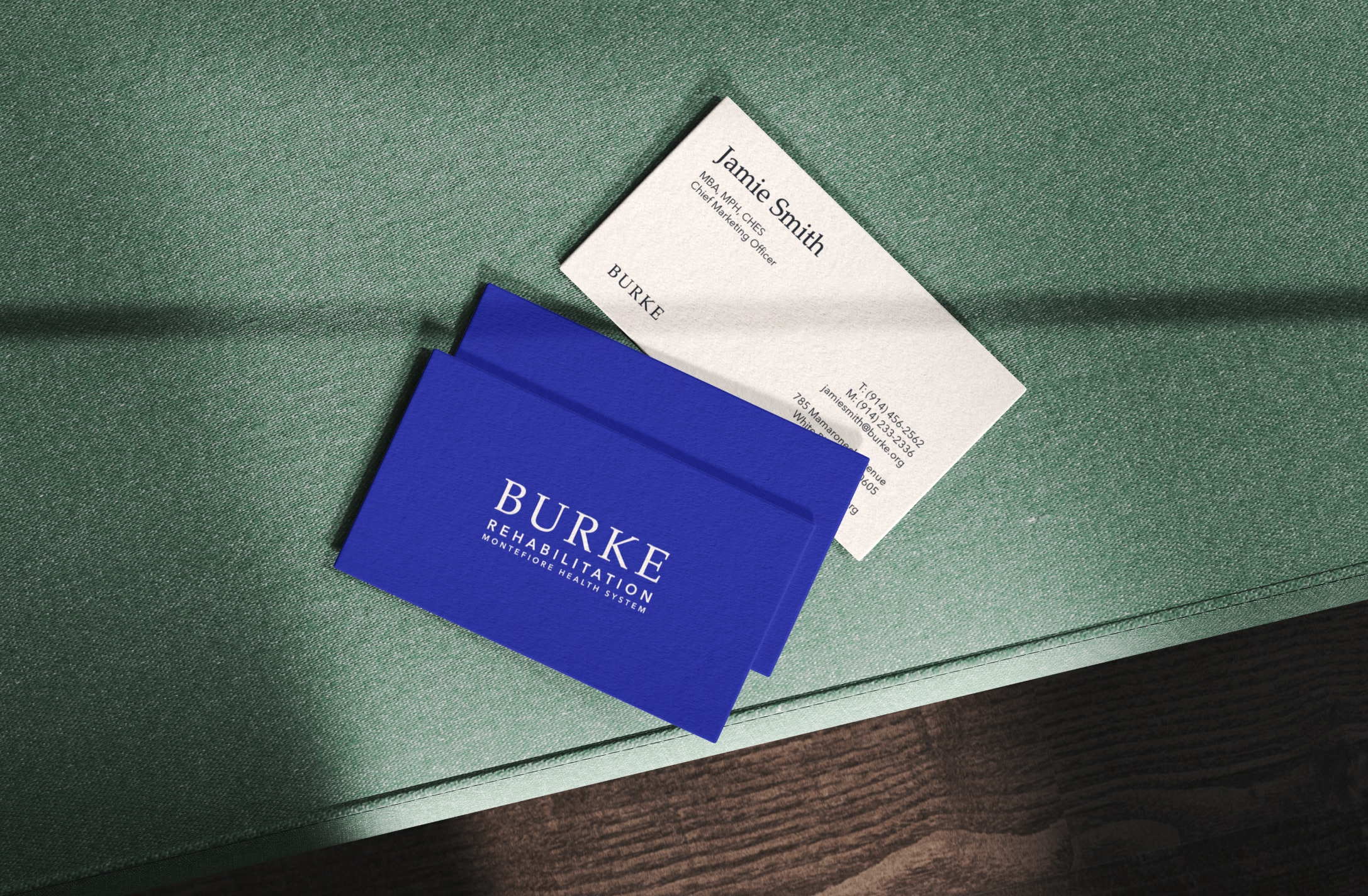
Burke Rehabilitation, a leader in physical medicine, needed to evolve its visual identity to reflect its standing as a premier, modern healthcare institution. I led the strategic repositioning and brand refresh, transforming a legacy clinical identity into a warm, human-first system that bridges the gap between expert medical care and the patient experience.
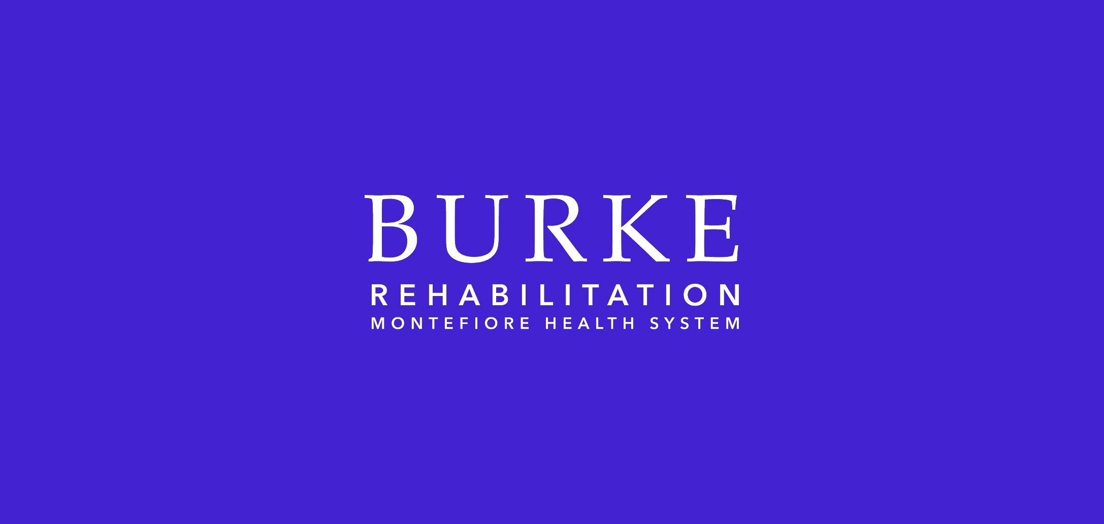
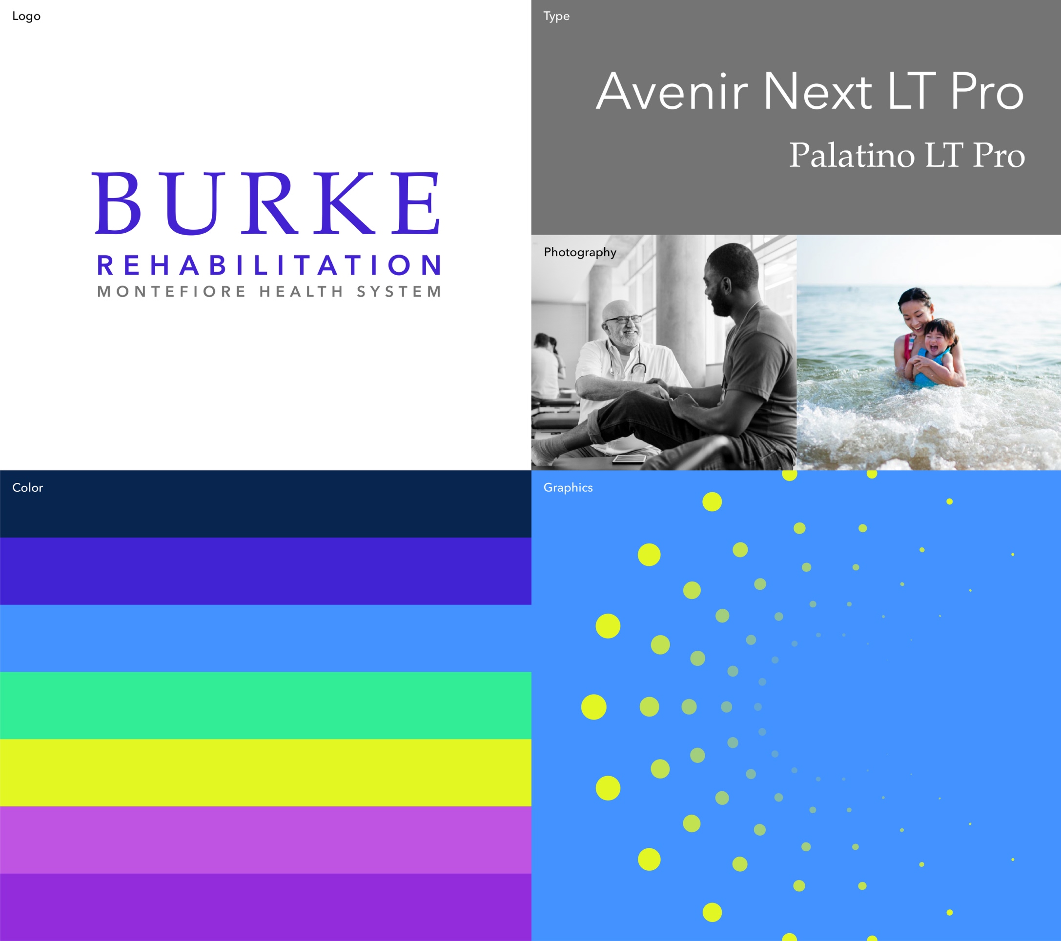
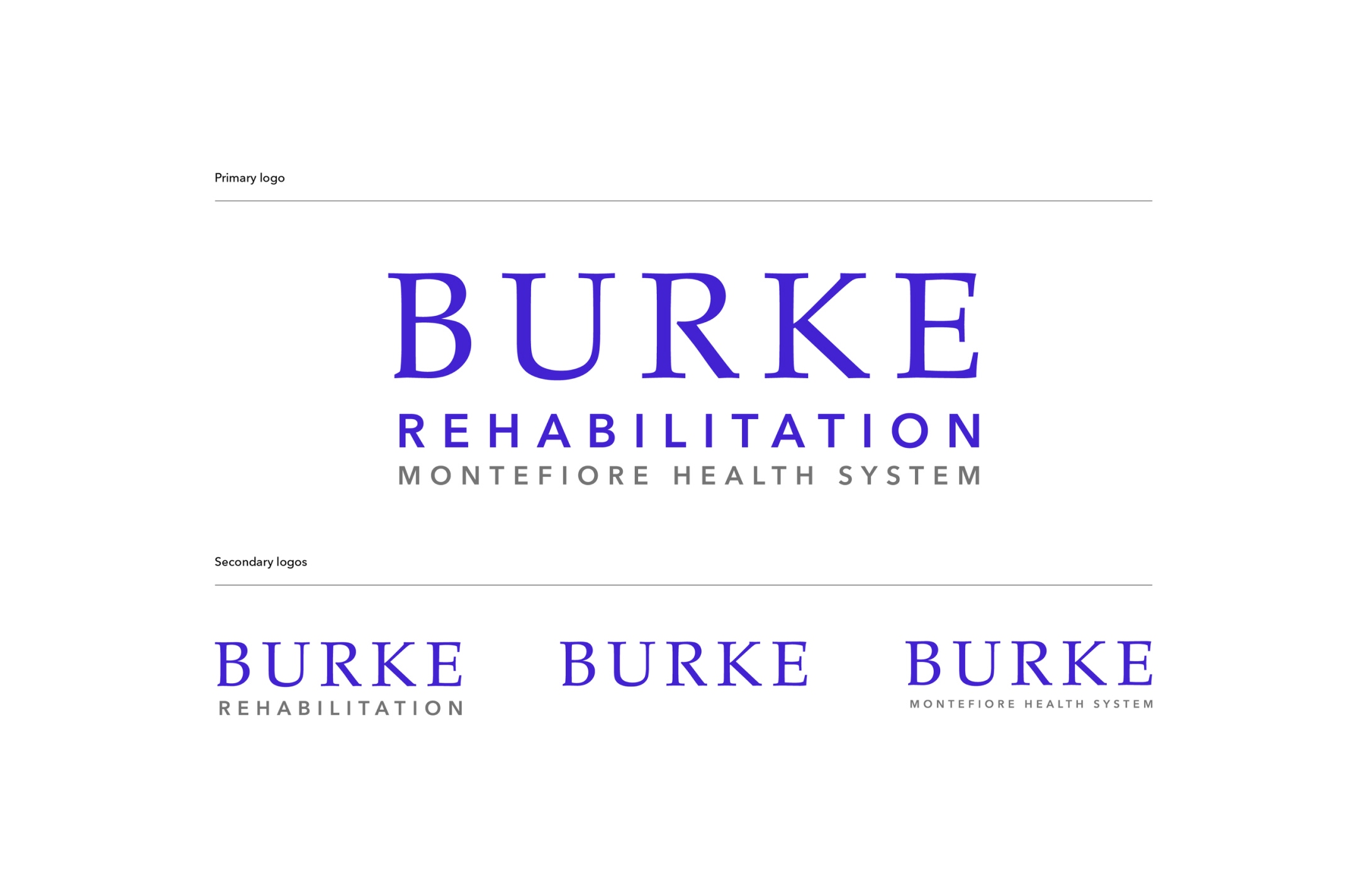
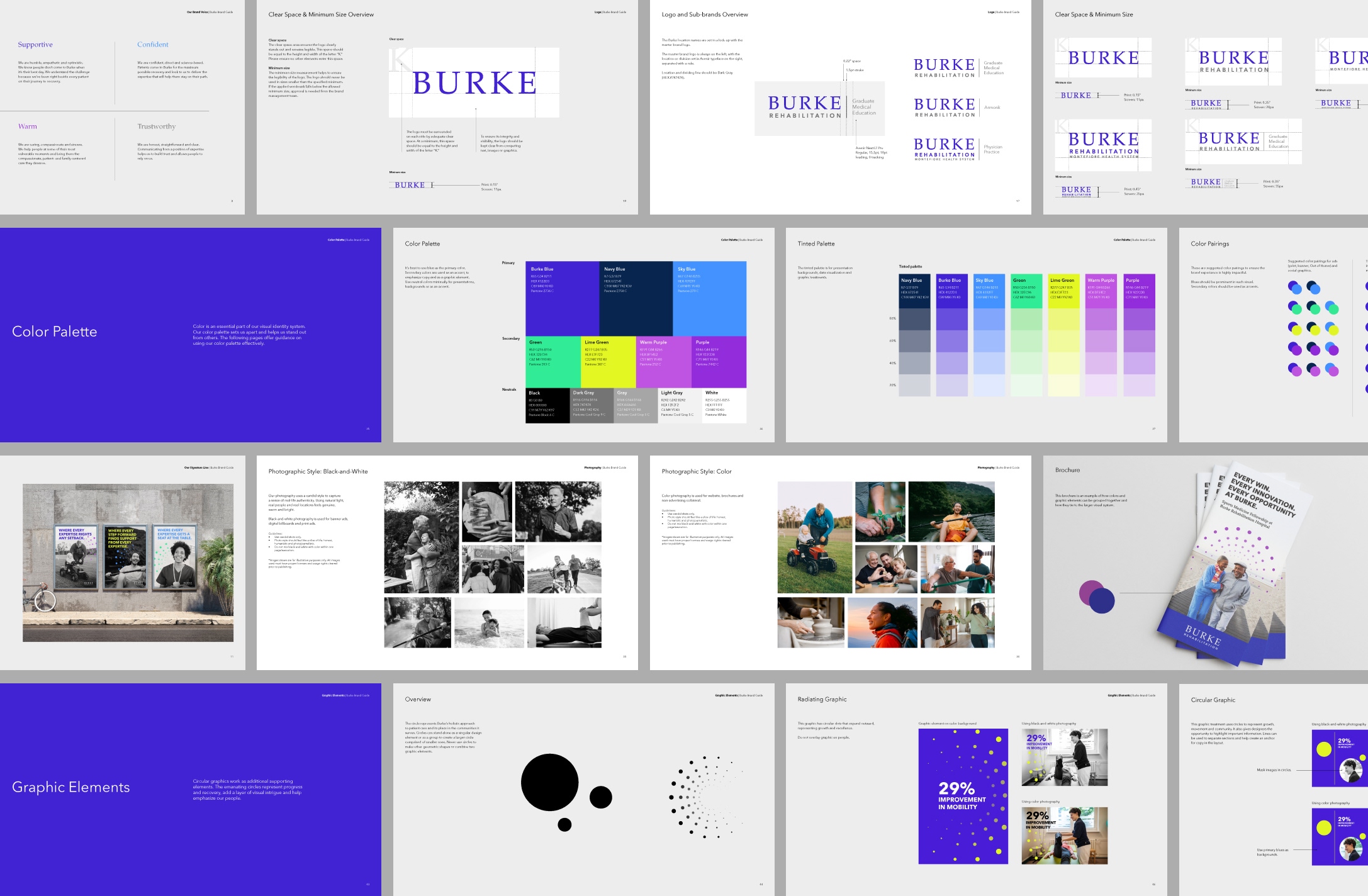
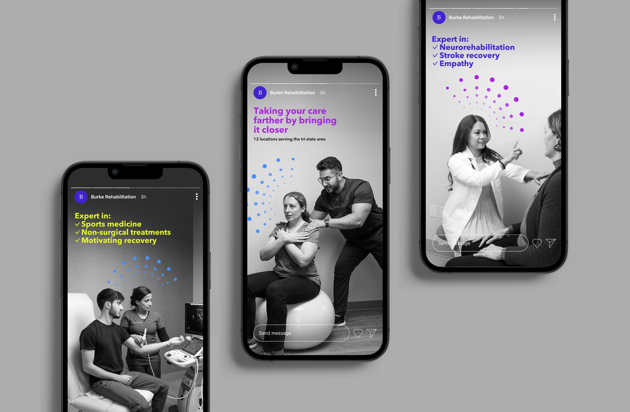
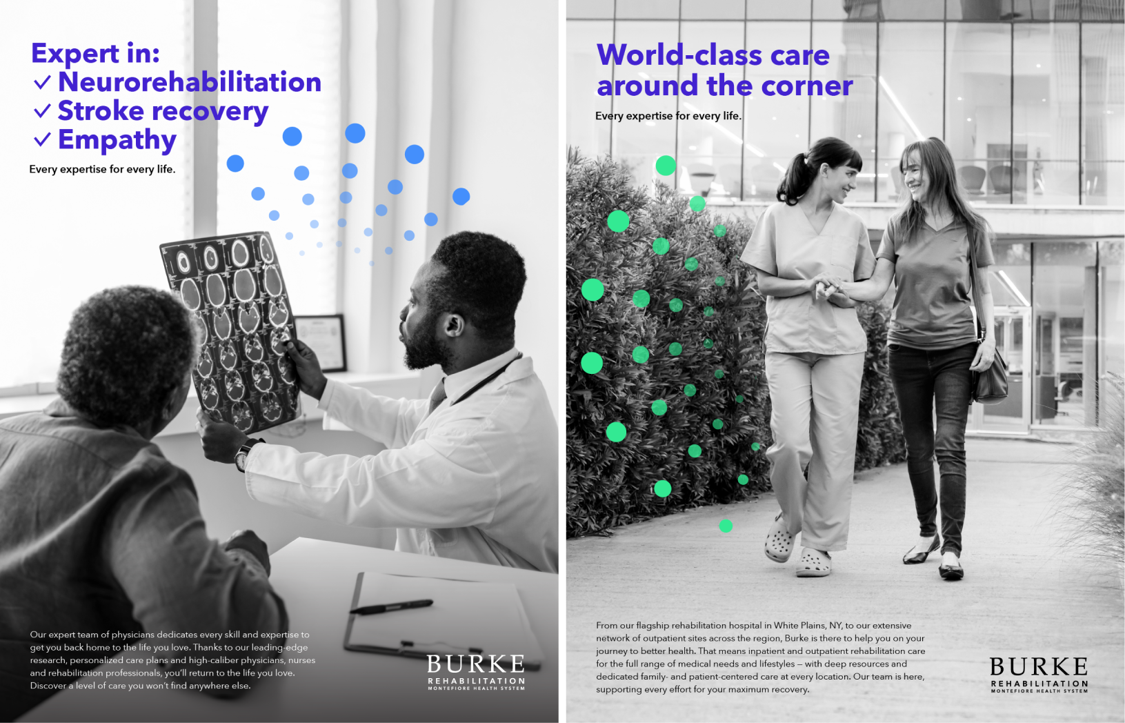
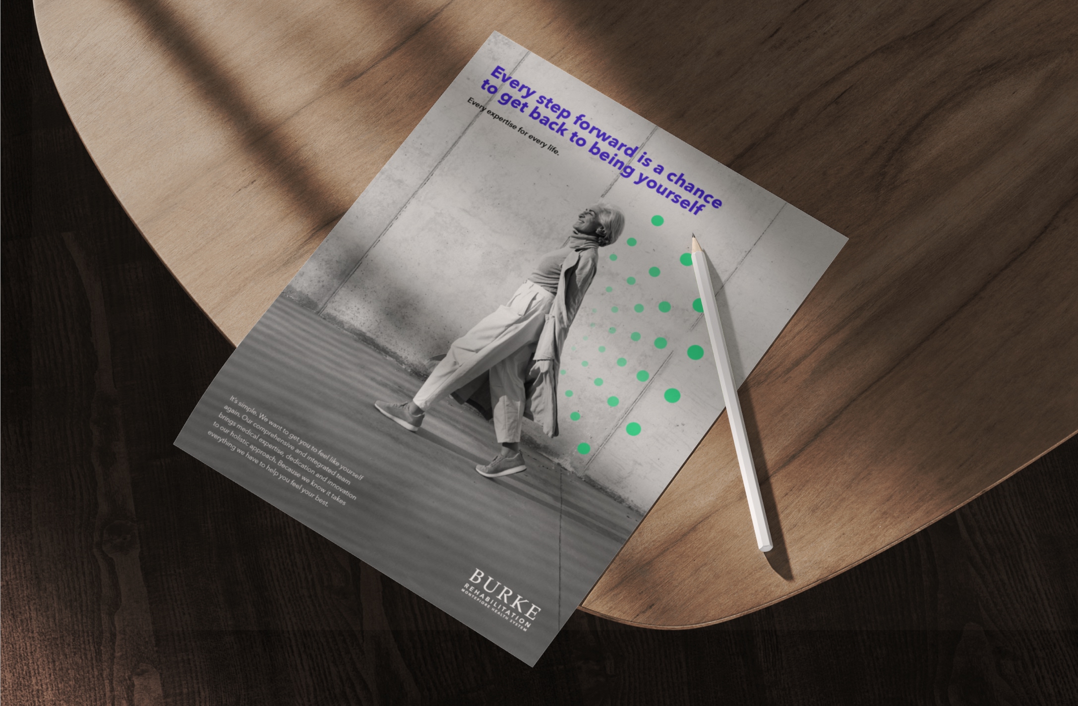
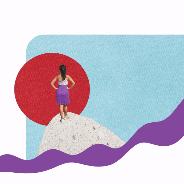
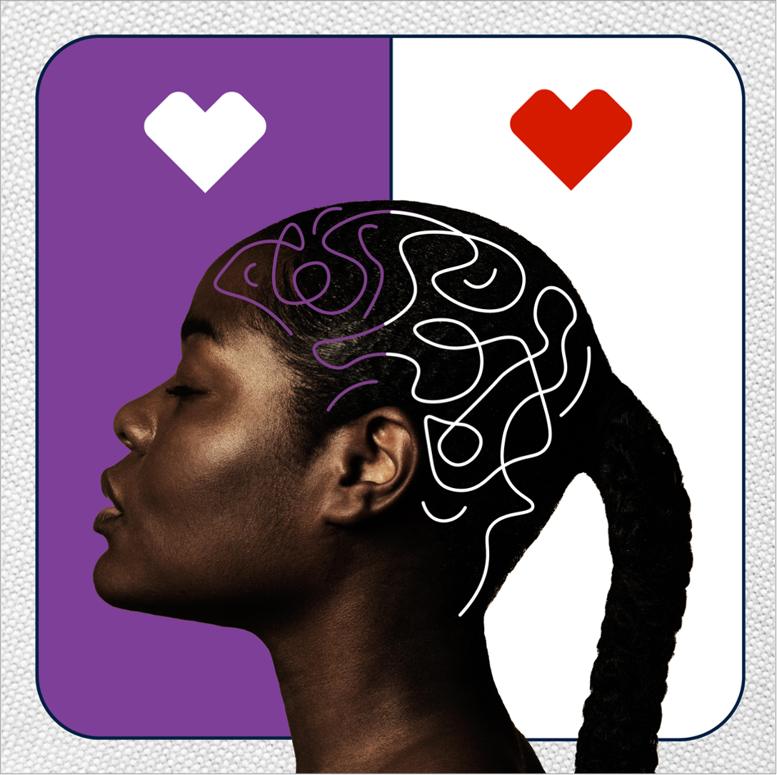
We created a full identity system—including brand story, tone of voice, logo, typography, color palette, and graphic treatments—that positioned Burke as a modern, patient-centered organization. The new electric blue serif logo, circular graphic motifs, and candid-feeling imagery brought warmth and credibility to the brand.
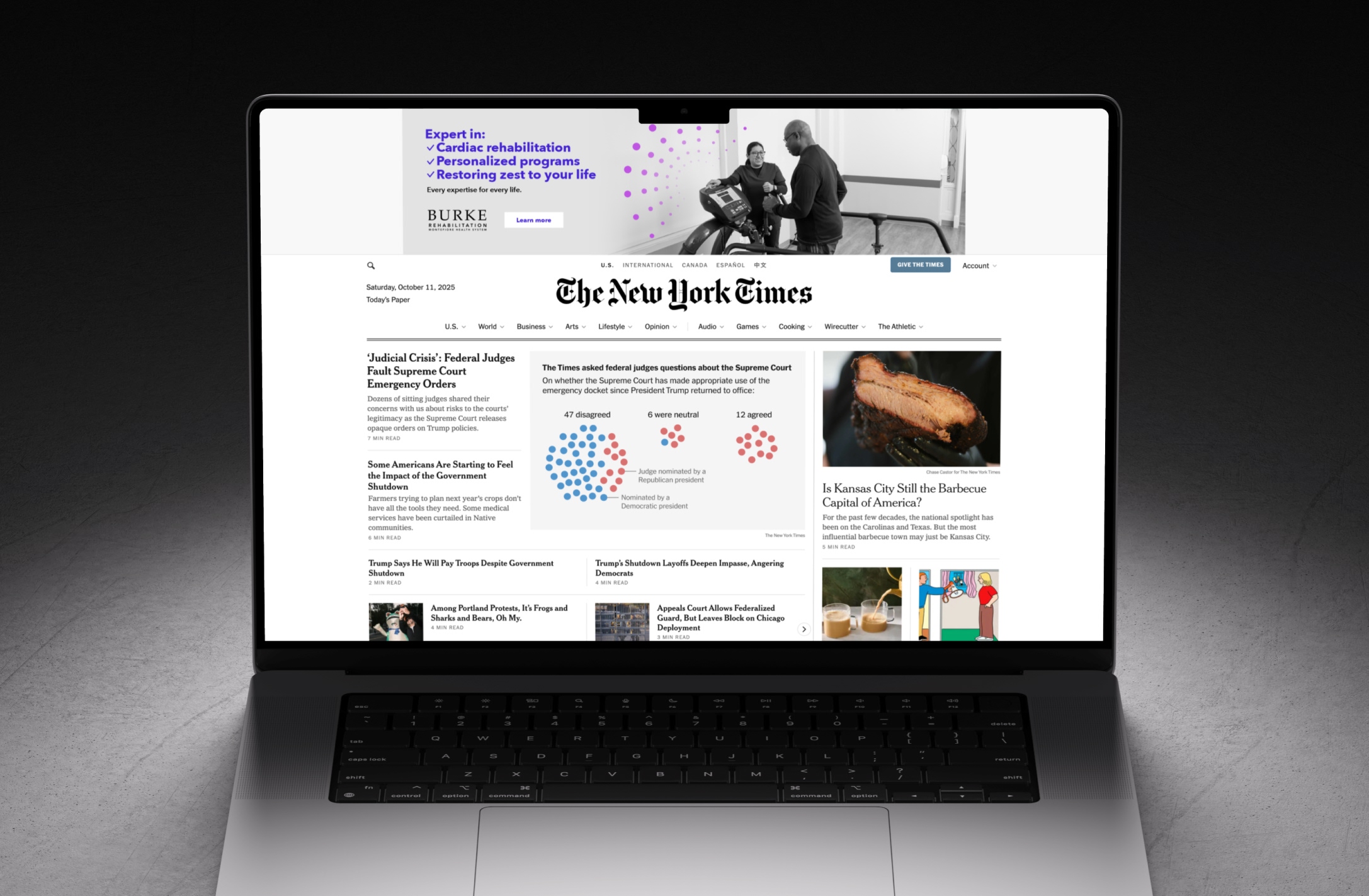
We rolled out a B2C and B2B campaign across digital ads, OOH, social, and print—highlighting Burke’s mission of delivering “every expertise for every life.” By streamlining the brand's visual language across all touchpoints, we created a cohesive narrative that resonates with patients, families, and healthcare professionals alike.


.gif)


.gif)